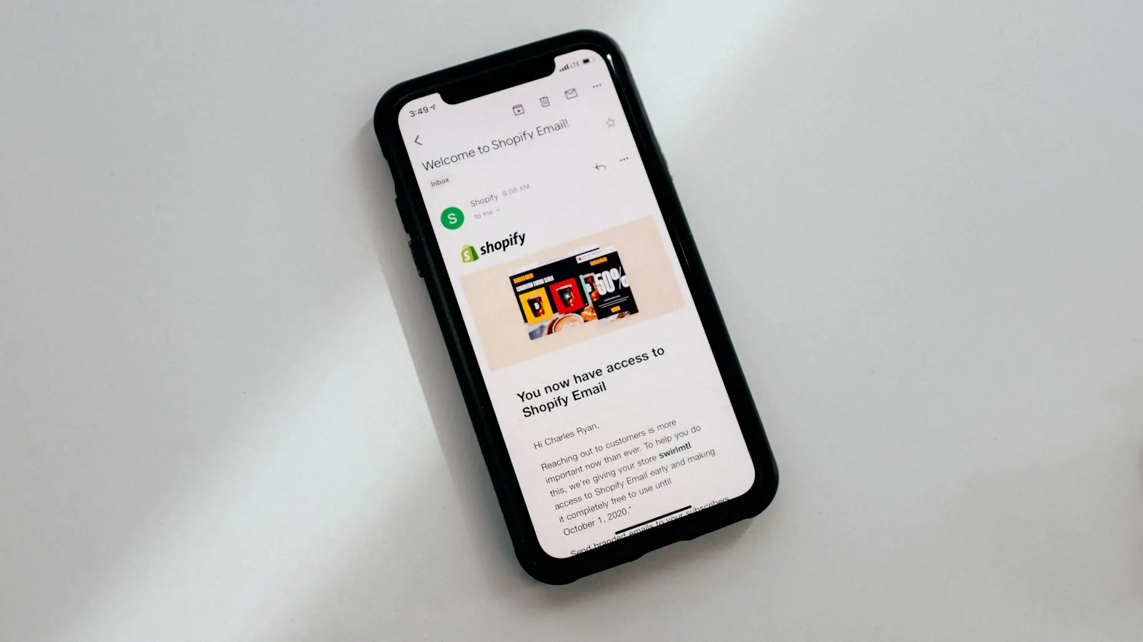
Web developers who build their first HTML email are often shocked. The techniques that make modern websites flexible, like grid, flexbox and external stylesheets, are unreliable or ignored in many inboxes. Email is the one place where a lot of web design wisdom from years ago still applies.
The good news is that the problems are well known, and a well-built template system solves them once.
Why emails break
Every email client renders HTML differently:
- Some classic desktop versions of Outlook for Windows use a Word-based rendering engine with limited CSS support.
- Webmail clients such as Gmail may strip or rewrite parts of your CSS.
- Mobile apps vary in how they handle responsive styles and dark mode.
- Apple Mail, which Litmus data shows accounts for a large share of tracked opens (Litmus), is generally more capable, which can hide problems in other clients during testing.
An email that looks perfect in one inbox can collapse in another.
Build defensively
Layout
Use simple, robust layouts: table-based or hybrid structures that stack neatly on mobile. Keep the main content column around 600–640 pixels wide.
CSS
Keep styles simple and well supported. Many teams inline critical styles, and use embedded styles only for enhancements such as responsive adjustments and dark mode.
Live text, not images
Image-only emails are fragile. Images may be blocked by default, screen readers cannot read them and some filters treat them with suspicion. Put your message in real HTML text and let images support it.
Size
Keep the HTML lean. Gmail clips messages over a certain size, hiding the end of your email, including the unsubscribe link, behind a “view entire message” link.
Design for real conditions
Images turned off
Add meaningful alt text and make sure the email still makes sense without images. Style the alt text where supported.
Dark mode
Many clients invert or adjust colours in dark mode. Use logos with transparent backgrounds or light and dark versions, avoid text inside images, and test how your brand colours behave.
Accessibility
The same errors that dominate website accessibility, such as low-contrast text and missing alt text (WebAIM), appear in email too. Also:
- use real headings and a logical reading order;
- keep body text at a readable size;
- make buttons large enough to tap, with descriptive link text;
- set the language attribute.
Unsubscribe
A clear unsubscribe link in the body, plus one-click unsubscribe headers for bulk marketing email, as required by Gmail and Yahoo (Google).
Build a modular system
Rather than coding each campaign from scratch, build a library of tested modules:
- header and pre-header;
- hero with image and headline;
- text block, two-column and three-column sections;
- buttons, quotes and stat callouts;
- product or article cards;
- footer with legal text and unsubscribe.
Marketers assemble campaigns from these modules in their email platform. The code stays reliable, the brand stays consistent and new campaigns take hours instead of days.
Test before every send
- Preview across major clients and devices, including classic Outlook and Gmail.
- Check dark mode, image-off view and mobile.
- Click every link and check tracking parameters.
- Send internal tests to real inboxes.
Where AI helps
AI can speed up email builds: converting a design into a first-draft template, checking code for unsupported CSS, writing alt text, generating plain-text versions and proofreading copy across modules. The final template still needs testing in real clients, because AI cannot see how Outlook will actually render it.
The takeaway
Reliable email templates come from defensive code, real-world design choices, accessibility and a modular system that marketers can use safely. Build it once, test it properly, and every future campaign benefits.
Template design and HTML build are core to our email marketing service. For inbox placement, read the Gmail and Yahoo sender rules.